List Tabs
List tabs contain the list of items that is present in each module. When the user selects the Library in the Explorer Window, all items in the list are presented on the List Tab. When the user selects a folder, only the items in that folder are presented. Data for each object are presented in a row.
The common features of List Tabs are described in this section. These features are:
- Sorting
- Filtering
- Group By Bar
- Contributors
- Scroll Bar
- Navigation Keys
- Status Bar
- Filter Bar
- Actions and Commands
These features are described as follows:
Sorting
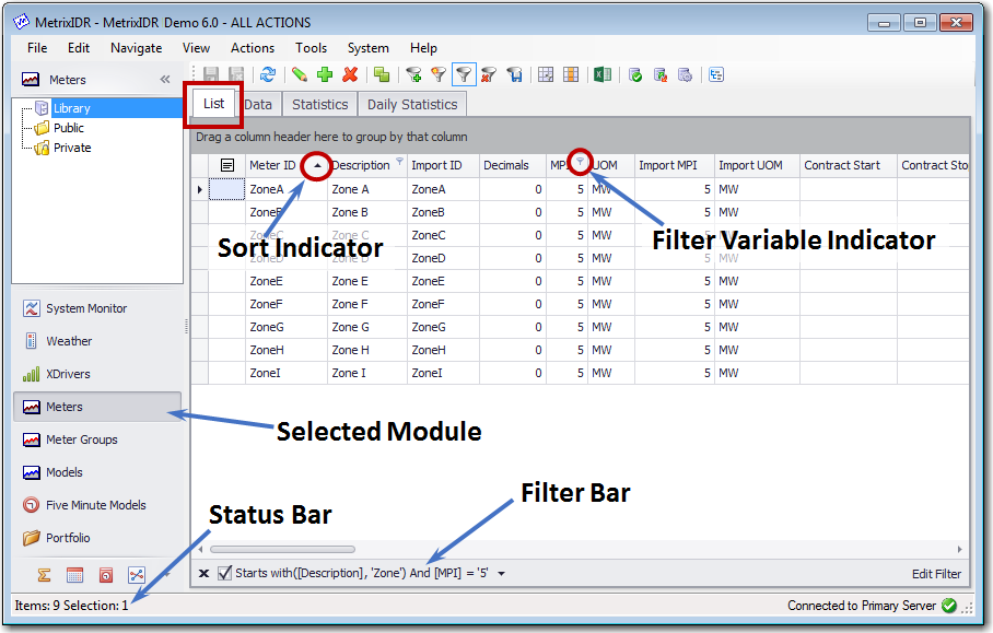
Lists are not presented in a fixed display order. The presentation order is determined by the field selected as the sort field and the direction of sort ( i.e. descending or ascending). The current sort order is identified by an up arrowhead for an ascending sort or a down arrowhead for a descending sort. To select the sort column and to change the sort direction:
- Click on a column header to make this the sort column.
- Click on the column header again to reverse the direction of the sort.
The sort order for each list is saved as a user setting. Changes to the sort settings will persist between one instance of the application and the next instance of the application for the user. Changes to the sort order by one user do not affect the sort order that is seen by other users.
Filtering
List Tabs may be filtered using several mechanisms including:
Whenever a Filter is defined on a List Tab, it is displayed at the bottom of the tab in the Filter Bar. If the filter is currently applied, a check mark appears in the check box to the left of the filter definition. The user can click on this check box to toggle the existing filter on and off. An equivalent set of actions applies to the Apply Filter button on the tool bar.
Group By Bar
List Tabs may be organized by making use of the Group By Bar. This is the dark gray band between the workspace tabs and the list with the text “Drag a column header here to group by that column.” Dragging a column onto this Bar creates a collapsed view. Each group can be expanded to show the list items within that group or collapsed to hide the list of items. The following Right-Click menu options are available for the Group By Bar.
- Full Expand.
- Full Collapse.
- Clear Grouping.
- Hide Group By Box.
Contributors
Some lists (Meter Groups, Schedules, Medium Term, and Compare Reports Modules) are structured to have a set of contributors for each item in the list. For example in the Meter Group module, there is one line on the List tab for each Meter Group. Each Meter Group in the list has a set of contributors (Meters that are added up to generate Meter Group data). Press the expand symbol (+) to see the list of contributors. Press the collapse symbol (-) to hide the list of contributors.
On list tabs, the user can edit the properties of items in the list. For lists with contributors, the user can also modify the list of contributors to a list item. When edits to a list item are made, the background of the edited row is shown as light green. This indicates pending edits that have been made but that have not been saved to the database. Select Save from the menu or press the Save Changes button on the toolbar to save changes to the database. Once changes are saved, the background for the edited item will return to normal.
Scroll Bars
Scroll bars are provided to move horizontally or vertically on each list tab. Additionally, once a cell is selected, the standard arrow and page up/down keys can be used to move to different cells. The following list summarizes navigation keys that can be used on a list tab.
Standard navigation keys (Left Arrow, Right Arrow, Up Arrow, Down Arrow, Page Up, Page Down)
- Tab key moves selection one cell to the right.
- Ctrl + Home takes you to the first cell (upper-left) of the list.
- Ctrl + End takes you to the last cell (lower right) of the list.
- Holding the Shift Key allows you to multi-select rows and cells.
- Holding the Control Key allows you to multi-select or deselect non-adjacent rows.
Status Bar
The Status Bar is located in the bottom of the User Interface. When the user is on the List tab in a module, the left hand side, the Status Bar indicates the number of items in the Library or in the Folder that is selected in the Explorer. It also shows the count of the number of items are selected in the list. On the right hand of the status bar, the name of the database that is being accessed is shown.
Filter Bar
The Filter Bar is shown at the bottom of the List Tab below the horizontal scroll bar. If no filter is defined, the Filter Bar is not be shown. If a filter is defined, the Filter Bar is shown. The Filter bar has four elements:
- Clear and Close. The first element is a X character to clear and close the filter. Clicking on the X will cause the filter to be cleared and the Filter Bar will be closed. This action is equivalent to selecting Clear Filter on the View menu or pressing the associated Toolbar button.
- Active/Inactive Checkbox. The second element is a checkbox. When a filter is defined, the Filter Bar is initialized with a check in the checkbox, indicating that the filter is active. The list that is shown is the reduced list with the filter applied. Clear the checkbox to set the filter to inactive. The full list will then be shown. Select the checkbox to apply the filter again. This action is equivalent to selecting the Apply Filter option on the View Menu or pressing the associated Toolbar button.
- Filter Text. The third element is the when a filter is defined. If there is no filter defined the Filter Bar Status Bar is located in the bottom of the User Interface. When the user is on the List tab in a module, the left hand side, the Status Bar indicates the number of items in the Library or in the Folder that is selected in the Explorer. It also shows the count of the number of items are selected in the list. On the right hand of the status bar, the name of the database that is being accessed is shown.
- Prior Filters Dropdown. If multiple filters have been defined for a list, a dropdown symbol will appear to the right of the filter text. Click on this dropdown to see the list of prior filters and to return to one of these filters. The list of filters is cleared when the user navigates to a different module.
- Edit Filter. On the far right of the Filter Bar is an Edit Filter button. Press this button to bring up the Filter Editor populated with the settings for the present filter. This action is equivalent to selecting the Filter Editor option from the View menu or pressing the corresponding Toolbar button.
Actions and Commands
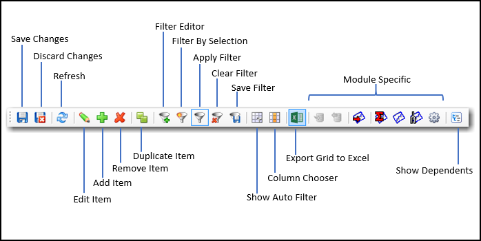
From the List tab, the user can implement a variety of actions and commands using the menus or toolbar buttons. Many of these actions are available on all list tabs, and some are specific to the module that is selected. The commonly available items are as follows:
Actions Menu
Add. Add a new item to the list.
Delete. Delete selected item or items from the list.
Edit. Edit properties of selected item or items.
Duplicate. Make a copy of selected .
Insert Contributor. Add contributors to an existing list item.
Remove Contributor. Remove contributors from a list item.
View Menu
Refresh. Refresh list data from the database.
Filter Editor. Open the Filter Editor dialog.
Apply Filter. Apply filter if it is off, Remove filter if it is on.
Filter by Selection. Create and apply a filter based on current selection.
Clear Filter. Clear the filter criteria and show the full list.
Save Filter. Save filter for later use.
Show Auto Filter Row. Activate auto filter on the header row.
Column Chooser. Select columns to show and manage column order.
Full Screen. Use entire screen to show the list.
Tools Menu
Export Grid to Excel. Open Save dialog to export list data to .xlsx file.
Show Dependents. Show objects that depend on the selected item(s).
Most of the common menu items are also available as buttons on the toolbar. Also, some menu items have corresponding hot keys (e.g., F5 for Refresh) and these are shown on the right hand side of the menu if they are available. The Toolbar buttons for the Models module are shown in the following illustration.