Geo Mapping map
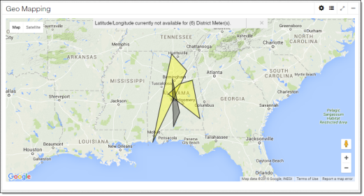
The Geo Mapping map highlights districts. Use this map to quickly assess the estimated district loss and location of districts.
For general information, see User interface basics.
-
District Polygon Colors tool (
 ). Use this to customize the colors associated with ranges in percentage of estimated loss. Ranges cannot overlap. The following percentage of estimated loss and colors are set by default:
-
Less than 0%: Red
-
Greater than or equal to 0% and less than or equal to 10%: Green
-
Greater than 10% and less than or equal to 20%: Yellow
-
Greater than 20% and less than or equal to 30%: Orange
-
Greater than 30% and less than or equal to 40%: Black
-
Greater than 100%: Red
-
Outside of the listed percentages: Grey
-
-
District Layers tool (
 ). Use this to hide or show district boundaries and district meters on the map. By default, district boundaries are enabled, and district meters are disabled.
 -
District boundary. Polygons indicate districts. The polygon's shape is based on the latitude and longitude of its associated service points. The polygon's color indicates the percentage of estimated loss range, as set in the District Polygon Colors tool. Click a district boundary to open a popup. For more information, see District boundary popups.
-
District meter (
 ). This icon indicates a district meter. If any district meters have missing latitude and longitude data, a message at the top of the map informs the user how many district meters will not appear. Click a district meter to open a popup. For more information, see District meter popups.