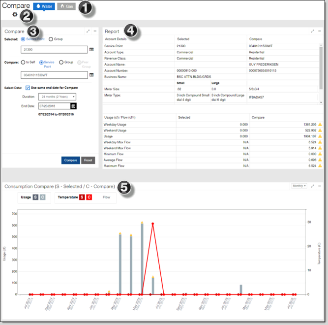
Compare
The Compare dashboard allows you to compare the operating details and usage of specific service points or groups over identical or differentiated periods of time. You can compare a service point or group to itself, another service point, or a group of service points. This can help you identify performance discrepancies and usage trends.
-
Commodity Selection tool. Use this tool to select the Gas or Water commodities for the page. This tool only displays if your Itron Analytics deployment has more than one commodity.
-
Set Units tool. Use this tool to change the units displayed on the page. The unit defaults and options available in this tool are configured in the Admin Portal. For more information, see "Enabled Units" in the Itron Analytics Admin Portal Online Help.
-
Volume. For example, Cubic Feet or Hundreds of Cubic Feet.
-
Flow. For example, Cubic Feet per Hour or Gallons per Hour.
-
Temperature. For example, Celsius or Fahrenheit.
-
-
Compare panel. Use this to select the service point or groups to be compared and the date range for the comparison. For more information, see Compare panel.
-
Report table. This table displays the selected and compared service points or groups' details and usage during the selected date range. For more information, see Report table.
-
Consumption Compare chart. This chart displays the selected and compared service points or groups' usage during the selected date range. For more information, seeConsumption Compare chart.