Data Tabs
Data tabs have two components. The top part (Chart View) provides a chart showing the selected data. The bottom part (Grid View) provides a grid containing the data values. The user can control whether to see one or both of the components. The options to control this are on the View menu with corresponding options on the Toolbar.
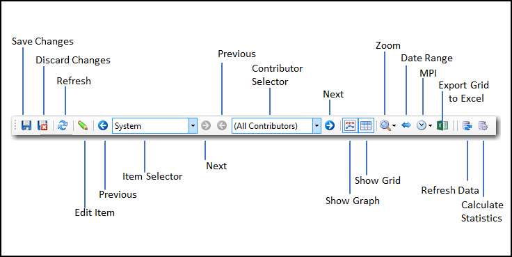
- Show Chart. The Show Chart is a toggle to activate or hide the chart component.
- Show Grid. The Show Grid is a toggle to activate or hide the grid component.
Between the Chart and Grid, the Data Range Selection bar provides a graphical tool to control the range of displayed.
Data Range Selection Bar
The Data Range Selection bar displays the range of possible data for display. The bar graphically displays the available data and controls the data view range using the scroll markers on the right and left sides of the bar. The Data Range selection bar limits the available data that may be viewed using the Date Range and Zoom commands located on the View Menu.
Chart View
The Chart component shows time series data for the selected item. The Grid shows the same data in tabular form. If the user zooms in to a time period (a year or a month for example), both the Chart and the Grid will show only the data for the selected zoom level and period. Commands and actions specific to the chart are available using the View Menu and the corresponding Toolbar buttons. Commands relevant to the data shown in the chart and grid include:
- Zoom. Allows the user to select the zoom level for the chart, ranging from 1 day to all.
- Date Range. Allows the user to limit the date range for data presented in the Chart and Grid.
- MPI. Allows the user to select the data frequency for the chart and the grid. As an example, this allows the user to view 15 minute data as hourly data.
- Options. Allows the user to set chart axis options (Fix the Maximum and Minimum, Show Zero).
Data View
The bottom section of the Data Tab shows the data for the selected item. In some cases (Weather, XDrivers, and Meters Modules), data in the grid can be filled, edited or deleted. For meter data, values can be marked as load control, marked as load event, and marked as bad for modeling purposes. The grid presents the data for the selected item, with one column per interval and one row per day of data.
The Data Grid uses the same color-coding scheme as the graph to present the marked data points with the cell color corresponding to the status setting of the data point. In the grid, Actual (unmarked) values are not highlighted, Load Control values are highlighted green, Load Event values in light blue, Filled values in dark blue, and Bad values in pink.
The Data Tab toolbar provides access to the main commands that apply to data. The example below shows the toolbar for the Meter Group Section.