DMA chart
On the Operational Visibility Region page, the chart panel (beneath the region map) displays graphed data representing the region's District Metered Areas (DMAs).
To toggle between a monthly, daily or hourly view, click the icon (![]() ) in the panel header and select Daily (
) in the panel header and select Daily (![]() ) or Hourly (
) or Hourly (![]() ). The icon changes to indicate the current selection.
). The icon changes to indicate the current selection.
Tip: To expand the graph for a larger display, click the maximize icon (![]() ). To restore the graph to its original size, click the minimize icon (
). To restore the graph to its original size, click the minimize icon (![]() ).
).
To select a specific DMA for any graph in this panel, select a DMA on the map, or select a row in the List of DMAs table. To change the graph that displays in this panel, click the Actions menu icon (![]() ) and select one of the following options:
) and select one of the following options:
-
Apparent Loss. Displays the DMA's apparent losses for the selected month.
-
Average Pressure. Displays the DMA's average pressure for the selected month.
-
Consumption Confidence. Displays the average consumption of the population within a DMA with +/- 95% confidence bounds per month and indicates the number of service points that fall outside of normal distribution bounds.
-
ILI. Displays the DMA's Infrastructure Leakage Index (ILI) for the selected month.
-
Meter Gain. Displays changes in consumption for meters that have been replaced within the DMA during the selected month.
-
Real Loss. Displays the DMA's real losses for the selected month.
-
Region Overview. Displays the region's details tabs, as also shown the region details panel (see Region details).
-
Zero Consumption. Displays the DMA's percentage of connections with zero consumption against the number of days with zero consumption.
-
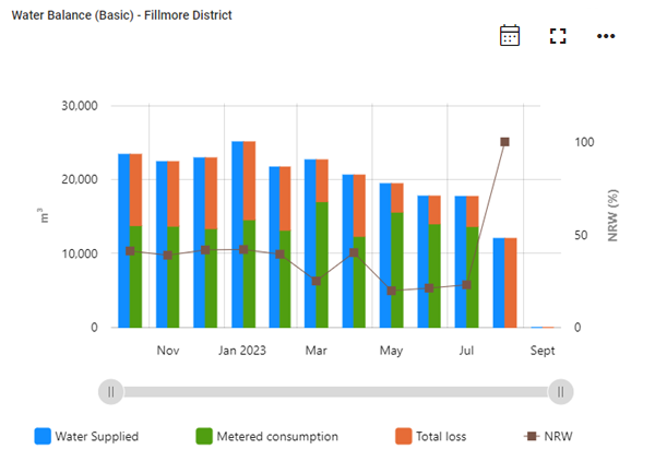
Water Balance (Basic). Shown by default for the selected DMA, this graph displays the volume of total water supplied, metered consumption, total losses, and non-revenue water (NRW) for the past 12 months. The Water Balance graph displays monthly data by default. If available, select the Daily or Hourly icon above the graph to view more granular data if it exists.
-
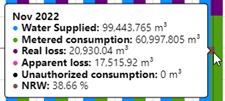
Water balance (Full). Displays the volume of total water supplied, metered consumption, real losses, apparent losses, unauthorized consumption, and non-revenue water (NRW) for the past 12 months. The Water Balance graph displays monthly data by default. If available, select the Daily or Hourly icon above the graph to view more granular data if it exists.
|
Note: The following calculations apply to total loss and non-revenue water (NRW) values:
NRW values are limited so that maximum NRW does not exceed +/-100%. See also Real losses (physical losses) and Apparent losses (commercial losses). |
To view exact values, hover over any point on the graph to reveal a color-coded tooltip.
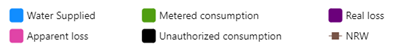
Refer to the legend beneath the graph for the color assigned to each metric. Click any legend items to hide the corresponding metrics; click again to restore the hidden metrics.
|
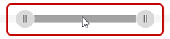
Tip: For a more detailed view of the data, drag the left and right ends of the slider beneath the graph to define the zoom range, and then drag the entire slider left or right to adjust the view.
The x-axis and data shown on the graph automatically scale to reflect the defined range. To restore the graph to its original view, click the Zoom out icon ( |
 ).
).To export the data represented in the DMA chart, take the following steps:
-
Click the Actions menu icon (
 ) and select Export. A dialog appears.
 -
From the Format dropdown, select Image or Data.
-
From the File type dropdown, select one of the following options:
-
Image format: Select JPG or PNG.
-
Data format: Select CSV.
-
-
Click Export. The file saves to your browser's configured download location.