Region map
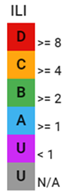
The Operational Visibility map displays the utility's regions as color-coded geographical areas. The shape of each region is based on the boundaries of the region's District Metered Areas (DMAs). The color of each region is based on the performance of the region's priority key performance indicator (KPI):
-
Red (D). The performance is bad. The utility is using resources inefficiently and non-revenue water reduction programs are imperative.
-
Yellow (C). The performance is poor. Non-revenue water reduction efforts should be intensified, even if water is plentiful and inexpensive.
-
Green (B). The performance has potential for improvement. Consider pressure management, better active leakage control, and better maintenance.
-
Blue (A). The performance is good. Further loss reduction may be uneconomic and careful analysis is needed to identify cost-effective improvements.
-
Purple (U). The value is less than zero.
-
Gray (U). Represents a region with no active DMAs.
Note: To change the priority KPI represented on the map, click the legend header and select an option from the Priority KPI dropdown in the dialog and then click Update.
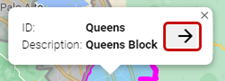
With a region selected on the map, click the arrow in the pop-up window to navigate to the corresponding Region page.
|
Tip: The standard Google Maps controls enable you to refine your view of the map:
|