Sectors map
The Transmission Mains Monitoring Sectors map provides visualization of water transmission mains and associated assets. If viewing the Sectors table, you can switch to the map view by clicking the view switcher icon (![]() ) in the page header and then selecting Map view (
) in the page header and then selecting Map view (![]() ).
).

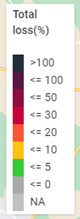
As shown in the legend, total loss percentages are indicated by sector with color coding (if data is available).
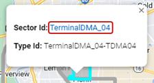
With a sector selected on the map, click the arrow in the information window to navigate to the corresponding Sector ID page. For more information, see Sector ID.
Click on a sensor icon (![]() ) to reveal an information window with the Sensor ID. Click the link to navigate to the corresponding Sensor ID entity page in Event Investigation. For more information, see Sensor ID (entity) page.
) to reveal an information window with the Sensor ID. Click the link to navigate to the corresponding Sensor ID entity page in Event Investigation. For more information, see Sensor ID (entity) page.

|
Tip: The standard Google Maps controls enable you to refine your view of the map:
|