Service point monthly consumption
The Service Point Monthly Consumption chart displays seasonally adjusted consumption data for the service point selected from the table on the Event Investigation page.
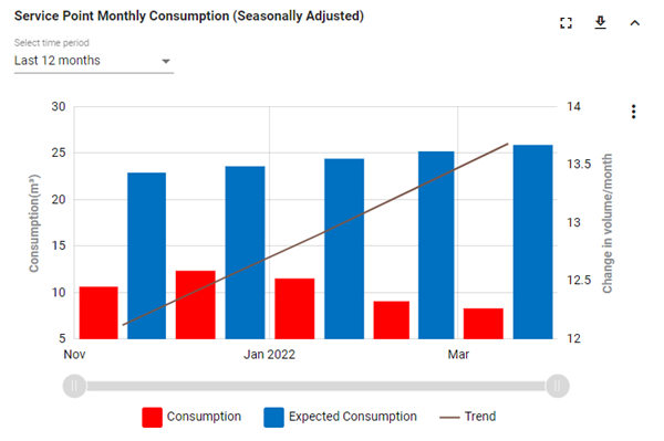
The x-axis represents months of the year. The y-axis represents water consumption in cubic meters (m3) and changes in water volume per month.
|
Tip: For a more detailed view of the data, drag the left and right ends of the slider beneath the graph to define the zoom range, and then drag the entire slider left or right to adjust the view.
The x-axis and data shown on the graph automatically scale to reflect the defined range. To restore the graph to its original view, click the Zoom out icon ( |

 ).
).The chart supports the following controls:
-
Refer to the legend beneath the graph for the color assigned to each metric. Click any legend items to hide the corresponding metrics; click again to restore the hidden metrics.

-
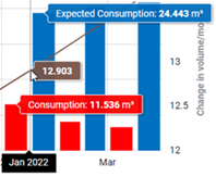
Hover over a point in the chart to reveal tooltips for the enabled legend items, including expected consumption, actual consumption, the usage trend, and the month.
-
By default, the last 12 months are shown. To change the timeline represented on the x-axis, select an option from the Select time period dropdown: Last 12 months, Last 24 months, Last 36 months, or All.
-
To export all monthly consumption data for selected time period, use the following procedure:
-
Click the download icon (
 ). A dialog appears.
 -
From the Format dropdown, select Image or Data.
-
From the File type dropdown, select one of the following options:
-
Image format: Select JPG or PNG.
-
Data format: Select CSV.
-
-
Click Export. The file saves to your browser's configured download location.
-