Interval data (leakage)
The Interval Data chart displays water consumption and leakage data for the service point selected from the Customer Leakage table on the Event Investigation page.
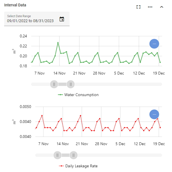
The x-axis on the Water Consumption graph represents water consumption intervals within the selected date range. The x-axis on the Daily Leakage Rate graph represents the water leakage average per day within the selected date range. On both graphs, the y-axis represents cubic meters per hour (m3/h).
|
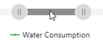
Tip: For a more detailed view of the data, drag the left and right ends of the slider beneath either graph to define the zoom range, and then drag the entire slider left or right to adjust the view.
The x-axis and data shown on both graphs automatically scale to reflect the defined range. To restore the graphs to the original view, click one of the Zoom out icons ( |
 ).
).The charts support the following controls:
-
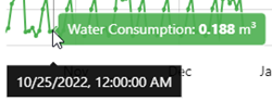
Hover over a point in a chart to reveal tooltips with values and timestamps.
-
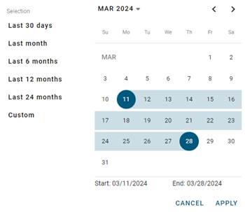
By default, the last 12 months are shown. To change the timeline represented on the graphs, select an option from the calendar dropdown: Last 30 days, Last 6 months, Last 12 months, Last 24 months, or Custom range.
For the Custom range option, select a date range from the calendar.
-
Click the beginning date on the calendar. Use the arrow icons to scroll to the desired month.
-
Click the end date on the calendar. The selected dates appear highlighted in blue.
-
Click Apply. The charts update accordingly.
-
-
To export the interval data for selected date range, use the following procedure:
-
Click the Actions menu icon (
 ) and select Export Interval Chart or Export Leakage Chart. A dialog appears.
 -
From the Format dropdown, select Image or Data.
-
From the File type dropdown, select one of the following options:
-
Image format: Select JPG or PNG.
-
Data format: Select CSV.
-
-
Click Export. The file saves to your browser's configured download location.
-