AP Loading panel
This panel represents the access point (AP) loading over a period of time. The count categories are 0–999, 1000–5999, 6000–7999, and 8000 or more.
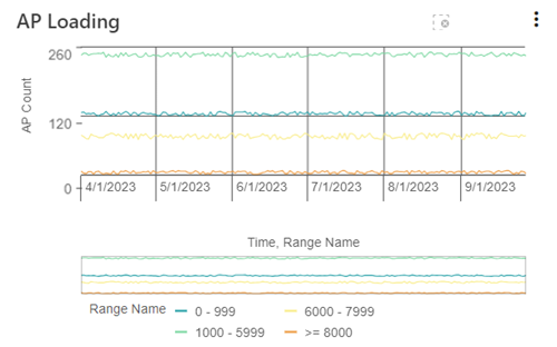
Refer to the legend beneath the chart for the color assigned to each range category. The x-axis represents the timeline over a six-month range. The y-axis represents the AP count.
The chart supports the following controls:
-
To graph only certain metrics, click one or more Range Names in the legend and then click the Confirm selection icon (
 ) that appears above the chart.
Note: To cancel selections prior to confirming, click the Cancel selections icon (X) that appears above the chart.
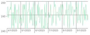
The chart rescales to adjust for the selected metrics.
-
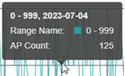
Hover over a point on the chart to reveal a tooltip with exact values for that point on the timeline.
-
For a more detailed view of the data, drag the left and right ends of the slider beneath the graph to define the zoom range, and then drag the entire slider left or right to adjust the view. The x-axis rescales to show the adjusted granularity.

-
To clear your adjustments and revert to the default view, click the Clear all selections icon (
 ).
). -
To view overutilized or underutilized APs in Network Operations, click the Menu icon (
 ) and select Overutilized APs or Underutilized APs to navigate directly to the APs listed in the Analyze table.
 -
To export the data as a CSV file, click the Menu icon (
) and select Export. The file saves to your browser's configured download location.Note: The exported CSV file contains data for the selected count categories shown on the graph. The date range spans the entire six months, regardless of any adjustments to the x-axis.