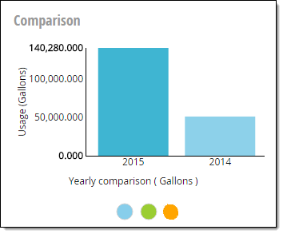
Comparison chart
Utility customers can use the Comparison chart to visualize their usage compared to their neighborhood, the previous year, or among service points on the account.
-
Comparison chart. This chart displays yearly usage compared to neighborhood, the previous year, or other service points on the account.
-
Y-Axis. Usage in the default unit.
-
X-Axis. Years, owner, or service point.
-
Chart Data. Hover over data on the chart to view a tooltip displaying the meter number (or number of peers in peer group when viewing Neighborhood Comparison) and usage.
-
-
Comparison type. Utility customers click these to select the type of comparison displayed on the chart.
-
Yearly Comparison (
 ). Displays a usage comparison to the previous year.
 -
Neighborhood Comparison (
 ). Displays a usage comparison to accounts in the meter's peer group. Peers are only available for Residential account type. The peer group is five or more service points with the same meter size, zip code, commodity usage type, and, if possible, customer-selected options in the Customer Portal (such as pools and irrigation).
 -
Meter Comparison (
 ). Displays a usage comparison to all the service points with a Residential account type of the same commodity on the user's account. This is only available for accounts with more than one service point.
-